Monday, September 27, 2010

Photoshop


Photoshop deals with pictures in a very different way than Illustrator. Illustrator uses mathematical formulae to create pictures and is considered a vector program (think back to your Trigonometry class and then think of the handles on a path in Illustrator). Photoshop is a bitmap (or raster) program, and uses pixels (the little dots in pictures) to create pictures. If you blow up a picture in Photoshop, you will see the individual dots, or pixels that make up the picture. Each pixel can represent one of hundreds of colors.

The Photoshop workspace is similar to InDesign and Illustrator, made of the document window or Canvas, the Toolbox, Toolbar, Menus and Palettes.
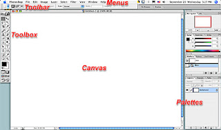


Photoshop (like InDesign and Illustrator) is considered an open-ended application. As the software developed over time, new features build upon – rather than replace – existing features. As a result, there are often several ways to achieve the same result. For example, the Layer Menu (an original feature) and the Layers Palette (a newer feature) share many of the same options.

Settle in for a good read (see reading assignment, at left) and then get ready for some good Photoshop fun.

Control Panel

As in InDesign and Illustrator, the Control Panel changes with the tool you have selected. We will explore some of these, especially those associated with the selection tools, the Crop tool, and some of the painting tools.

Meet the Toolbox

One of the first things you notice about Photoshop is that its Tools are quite different from Illustrator or InDesign. Heres' a brief run-down:

Selection Tools

Marquee tool - makes selections, rectangular, oval; Crop - Crops photos
Move - moves selection
Lasso - makes freeform selection; also Polygonal Lasso and Magnetic Lasso
Magic Wand - selects same or similar colors

Painting Tools

Paintbrush - paints w/ soft edge with foreground color
Eraser - erases to background color
Clone Stamp - clones portion of image
Smudge - mooshes image as if it's wet paint; Sharpen- sharpens image; Blur - makes image fuzzy
Burn - darkens image; Dodge - lightens image; Sponge - desaturates color


Other Tools

Pen - makes/edits vector paths for clipping or shapes
Text - creates type
Gradient - makes graduated fill
Paintbucket - fills area with solid color
Eyedropper - samples pixel color
Hand - moves view around
Zoom - zooms in/out

Foreground/Background - the boxes at the bottom of the toolbox are not fill and stroke as in InDesign and Illustrator. They are Foreground (upper left, in this case orange) and Background (lower right, in this case blue). The Eyedropper Tool samples color and makes it the Foreground color. The little curvy arrows to the upper right of the Fore/Background colors allow you to toggle between the two, switching the Foreground to the Background color and vice versa. The black and white box to the lower left reset the colors to black and white. Click on either box to get the Color Picker and a spectrum of colors to choose from.

Menus

Not all menu items will be addressed, just ones which will be used most often in this class. But don't feel limited to these alone – explore the menus and palettes, dig around in the submenus, experiment with filters.

File Menu

New - Create new file Image size
Width, height = units
Resolution = dots per inch (dpi)
Mode = grayscale, cmyk, etc.
Contents = background color
Save / Save As / Save a Copy - file formats. eps and tif are best and most universally accepted for printing.
Import - scanning plug-ins are found here
Revert
Preferences - change units, among other things.

Edit Menu

Undo/Step forward/Step backward (see also History Palette)
Copy/Cut/Paste
Paste Into ("Paste into" pastes into a selection and masks off everything that is not selected)
Fill - fills selection with color
Free Transform/Transform - allows transformation/distortion of a selection
Purge - deletes selected items from memory (frees up disk space if you're running low)

Image Menu

Mode - mode of color (differs from color models)
Bitmap - black & white
Grayscale - shades of gray
CMYK - 4-color process color
RGB - red-green-blue, the mode with which images are captured by scanners or digital cameras
Adjustments - many options for adjustment of color, contrast, hue, saturation, etc., etc., etc.
Image Size - File size and resolution
Canvas Size - the physical dimensions of the file (width and height)
Rotate Canvas - rotates and flips image
Crop - crops to the selection

Layer Menu

New - creates new layer
Duplicate layer Delete layer
Layer style - effects, such as shadow or glow;
New Adjustment Layer - allows you to adjust image in a new layer without altering original layer
Layer Mask - hides/reveals portions of a layer
Arrange - moves layer in front of or behind other layers
Align Merge Layers - merges selected layers
Merge Visible Layers - ignores hidden layers
Flatten - merges all layers

Select Menu

All - selects entire canvas or all pixels in a layer
Deselect/Reselect - turns off selection, remakes selection
Inverse - inverts selection: what was selected is no longer selected, what was not selected is selected
Color range - selects color based on sample (similar to using Magic Wand tool with Contiguous color off)

Modify - alters selection Border - makes selection into a border which can be filled with color
Border - selects a width of pixels inside and outside an existing selection
Smooth - smooths "jaggy" selection
Expand/Contract - makes selection larger or smaller
Grow - expands selection into neighboring pixels of similar color
Feather - feathers selection after selection is made
Similar - expands selection into similar color pixels throughout the canvas
Transform - change size of selection
Load Selection - allows you to load a saved selection or transparency mask as a selection
Save Selection - saves selection for future use

Filter Menu

Many of the filters in this menu are used to create unusual and artistic effects. I encourage you to experiment with them. If only a portion of a photo needs altering, select it, and apply a filter. Apart from the artisy filters, here are some faves:

Blur/Gaussian Blur - fine control of blurring, try applying this filter a couple of times at low blurring to keep image from looking fuzzy
Noise/Despeckle/Reduce Noise - blurs photo, attempts to remove artifacts
Dust & Scratches - fine control for removing arifacts from image
Sharpen - the regular sharpen feature is a good place to start. If it looks too harsh, try Unsharp Mask which allows fine control of sharpening feature, apply this filter a couple of times at low sharpening to keep image from looking harsh

Palettes

Again, as in InDesign and Illustrator, many of Photoshops Palettes hold a wealth of options. We can't cover them all, so happy exploring.

Brushes - different sizes, shapes and effects for painting tools
Character - text controls
Color - sliders for controling color mixes; color picker
History - unlike InDesign and Illustrator, Photoshop has only one "undo" – go back to previous states using this palette
Layers - effects, transparencies, blending modes, masking
Paths - vector paths for masks and shapes
Swatches - saves preset colors


Other helpful terms

The Canvas - the workspace of the file
Status Bar - at bottom left, options to show file size, current tool, etc.

Sunday, September 26, 2010

Pull the look together with the right accessories — and type

You're off to a good start with your brochures. All have interesting topics and much potential. Here's some things to keep in mind while you're designing your layouts.

Make it easy for your reader to navigate your document -- show them where to start and end reading, and arrange information in a clear and logical way. Create headings that introduce sections or topic and make finding information easy. Assume your reader knows nothing about your topic, so make sure that everything is fully explained.

When creating your brochure – or any layout, for that matter – create unity of design by limiting the typefaces you use. Using many different typefaces and styles confuses the reader. If you use only two or three typefaces you create a sense of unity throughout the layout and guide your reader through all the important information you have to communicate.

Here are a couple of examples from a past class. Which do you think achieves the goals outlined above? How could they be improved?


Text styles and sizes create a hierarchy of information – just like in a traditional outline – so that your reader will know what is most important. Headings (headlines) tell the reader about the information that follows. Subheadings break the information down further. The Text contains the details.

Bonus Tips: 
Bullets • • • • • • • 
Dashes — – — – — 
and Hyphens - - - - -


Bullets, typographically speaking, create a professional looking list:

  • List item number one
  • List item number two
  • List item number three
  • List item number four

Here are two ways to achieve bulleted lists.

(1) Type Option + 8. I remember it because asterisks (*) look something like a bullet (•). This works in InDesign, Illustrator and Photoshop. Add a space between the bullet and the following text (just like a space between words).

(2) InDesign has a groovy Bullet List feature. Select the text that is your list, go to Type Menu>Bulleted and Numbered Lists. You also have the option of creating Numbered Lists. This feature automatically adds space between the text and bullet.

Dashes and hyphens are often misidentified and wrongly used interchangeably.

Hyphens break a whole word (as when a word is too long to fit onto a line and it's broken to wrap onto the next line) or join two words into a compound word (as in "long-time friend"). The dash/underscore key is between the zero key and the plus/minus key.

Dashes are a separation between words or concepts, such as this:

The Elements of Typographic Style recommends the more concise spaced en dash – like so – and argues that the length and visual magnitude of an em dash "belongs to the padded and corseted aesthetic of Victorian typography."

There are two types of dashes: the n-dash and the m-dash. The n-dash is option key + hyphen key,  the m-dash is shift+option+hyphen. N-dashes are acceptable for most dashed text. Read the link above on dashes to get a better idea of when to use n- or m-dashes.

Wednesday, September 22, 2010

Links to more Illustrator tutorials than you can shake a pen tool at

http://veerle.duoh.com/
Links to some step-by-step web pages (some good, some not so good):
http://www.google.com/search?q=illustrator+tutorial+pen+tool&ie=utf-8&oe=utf-8&aq=t&rls=org.mozilla:en-US:official&client=firefox-a

http://www.delicious.com/HMHarvey1/bundle:Tutorials

Or watch videos on YouTube:
http://www.youtube.com/results?search_query=adobe+illustrator+cs3+tutorial+pen+tool&aq=f

Trace over an image to create vector art

Create vector art by using it as a template and tract it in Illustrator.

Open an image in Adobe Illustrator

It can be a bitmap or vector image. We're going to use this bitmap image of a Califoria poppy.


Think of this image in terms of its component shapes, not as the thing itself. Look at each petal, sepal and stem.What colors and shapes do you see?

Begin tracing with the pen tool

Let's begin with the large petal first. Use the pen tool to create a vector shape based on the shape of the petal.

Continue to trace the shapes...


Add fills to your paths

When you're finished tracing, use the Swatches or Color palette to add colors to your illustration.


You can choose to leave or remove the strokes from your illustration. Here I chose to remove the strokes and add gradient fills.


Open both the Color palette and the Gradient palette. Select the object (one of the petals, for example) and apply a gradient fill by clicking on the gradient. Illustrator's default gradient is white to black.


Change the color of the gradient
  • Click on a tab on the gradient ramp, adjust the color in the color palette (you might need to convert a grayscale black to a CMYK or RGB color)
  • Or drag and drop a color to a tab on the gradient ramp


To change the direction of the gradient, choose the Gradient tool, then click and drag across the selected object. Change the blend point by moving the middle slider. Additional color tabs can be added by clicking on the ramp. Adjust color as above.


Vector beauty!

Monday, September 20, 2010

Creating and Maintaining a Portfolio for Employment

A portfolio is a tangible representation of your education and work experience. It is an organized collection of your work which will allow you to demonstrate to a potential employer your strengths, skills and achievements, and an expression of your special qualifications and unique abilities. Use it to show a potential employer why you are the right person for that job or internship.

A portfolio can contain, but is certainly not limited to:
  • Your resume
  • Letters of recommendation or commendation
  • Transcripts
  • Class assignments
  • Photos of projects or displays
  • Outlines of lectures or presentations
  • Photographs of yourself at work
  • Transcripts
  • Certificates of achievement
  • Academic recognition
  • Examples of brochures, handouts, flyers, etc. you've created or helped create
  • Samples of your writing
  • Examples of hobbies or special skills
There are two types of portfolios: traditional and electronic. A traditional portfolio is a physical document such as a three-ring binder, presentation folder, artist portfolio or zippered case. An electronic portfolio can be a website or a PowerPoint presentation distributed on a CD. And you don't have to choose between the two, although it might be best to start with the traditional portfolio in order to begin organizing your collection of documents. Then use it as the basis for an electronic portfolio (see below).

Create your portfolio by collecting anything that relates to your academic or work experience. Collect everything (yes, everything, then organize it later). Keep your collection of documents current by adding to it as your experience grows. Then when it comes time to organize you'll have a good selection to choose from.

The projects you will create in this class offer you the perfect opportunity to begin assembling an employment portfolio. In this class you will design and create several documents suitable for portfolio pieces. These assignments allow you the opportunity to create portfolio pieces to exhibit your creativity and ability to use CS3 software.

Next, organize your portfolio to demonstrate your abilities and achievements. There are many different ways to organize your collection including chronological, topic or subject (such as Math or English), and lesson or ability (such as teamwork or communication). Depending on the type of case or binder you choose, organize each item in individual sleeves or pages. Be sure to include a brief, descriptive caption for each item (the exception might be documents such as your resume, letters and transcripts). Use tabbed and labeled dividers to separate sections and keep everything neat and tidy. Add to it as you learn, grow and create new projects; clean out older projects that don't represent your current level of ability or interests.

When the time comes to go to an interview, customize your portfolio for the specific position. Filter out unnecessary documents and include only that which pertains to the particular skills needed for the position. For example, if the job or internship requires public speaking, be sure to include proof of your ability, such as an outline of a presentation you have given or a photo of yourself addressing a group. Limit the size of your portfolio to 15-20 pages. Also, remember that portfolios are a reflection of the individual. In all my years I've never seen two that are alike and there is certainly no single "correct" way to assemble your portfolio. It will represent your personality and unique abilities.

Finally, you can present your portfolio during your interview. Be sure to inform your potential employer that you have a portfolio of related material that you can bring to your interview and ask what material might be important to bring. Check the University of Wisconsin-River Falls' portfolio website for more excellent tips on how to put together a portfolio and how to present it at an interview.

E me


Electronic and "disposable" portfolios are becoming more and more common. Potential employers can view these in advance of your interview. In the case of online portfolios, employers can search the internet looking for a person with your qualifications and contact you via email through a link on your site. Portfolios that are sent to a potential employer on CD or other portable media are considered "disposable" as they may not necessarily be returned to you.

Electronic portfolios are created in much the same way you would your traditional portfolio --- collecting, organizing and customizing --- but instead of compiling everything in a three-ring binder, work is documented electronically (for example, by scanning, digital photos or pdf files) and compiled so that the potential employer can view your work on a computer.

If you have the technical ability, you can create your own. If you're electronically challenged, enlist the aid of a friend or professional. As mentioned above, your electronic portfolio can be in the form of a website, CD or Power Point presentation. Keep in mind that the format should be cross-platform (compatible for both PCs and Macs) and industry-standard software (for example, html or Power Point).

Further resources

Read more about portfolios, what they should contain, and how to organize them:

http://art-support.com/portfolio.htm
http://jobsearch.about.com/cs/resumes/a/portfolio.htm
http://www.uwrf.edu/ccs/portfolio-steps.htm
http://www.bsu.edu/students/careers/documents/portfoli

Electronic portfolio information and hosting:

http://ideas.veer.com/portfolios
http://www.photoshopcafe.com/tutorials/portfolio/portfolio.htm
http://www.impactfolios.com

Example of E-portfolios

http://erinadamsphoto.com
http://www.philipchudy.com
http://www.squidlock.com
http://ideas.veer.com/members/757817/portfolios

Monday, September 13, 2010

Making a Layout: The Elements and Principles of Design

The Basic Elements of Design

The basic elements of design are like the ingredients of a recipe. They must be used in the proper combination and proportion to work. A layout may use some but not necessarily all elements.


Line - Any mark connecting any two points. It could be a graphic line, or a string of text.

Shape - Anything that has height and width. Graphics, text blocks, photos.

Texture - The look and feel of a surface. Smooth or bumpy, complicated or simple.

Space - The distance or area between or around things. Does it have breathing room or is it crowded? How is positive (or negative) space used?

Size - How big or small something is. Do the objects in the layout have contrasting or similar sizes?

Value - The darkness or lightness of an area or object. Too much text and crowded graphics give and overall dark value.

Color - Just what is it. Conveys emotion or mood, highlight important items, and so much more!

The Principles of Design

Once you understand the basics, put them together using the recipe dictated by design principles. As with the elements, a layout takes all these principles into consideration, but does not necessarily have to utilize them all.


Balance - An equal distribution of weight. Unbalanced layouts (used with care) can be used for emphasis.

Rhythm - A pattern created by repeating elements. Similar shapes, sizes, colors.

Emphasis - What stands out and gets noticed first.

Unity - All the elements look like they belong together. What holds it all together?

Organize your thoughts

Organization is also important to a successful layout. Arrange your information logically, most important first, then in decreasing order of importance. Catch and hold the reader's attention with headlines and graphics, keep them reading with well-written copy and pleasing design.

Placement on the page can indicate the importance of text or a graphic:


Upper Left - #1

Position of highest prominence, emphasis or importance

Upper Right - #2

Second most prominent

Lower Left - #2

Second most prominent, equal in importance to Upper Right

Lower Right - #3

Least important


How a reader looks at your layout is almost as important as what they read. English-speakers are taught to read from top to bottom, left to right and generally that's how the reader's eyes will travel across a page. You can also direct the way they view the page by the pictures you use and how they are arranged. Some pictures are natural "pointers" such as a person's profile. The reader will naturally look in the direction that the photo is "looking." The composition of photos and graphics also lend themselves to "pointing."

Consider the way your eye travels across the page. You read from left to right, and a harmonious layout will keep with that flow. If you wish to shock the reader, work contrary to their expectations.

The next time you look at a magazine cover or poster or... well...anything... make a note of how you look at it.

One more thing... or two...

Keep your reader in mind while designing and writing your layout. Are they twelve-year-olds? Do you think they'll have at least a high school education? Are they retired Republicans or young Democrats? Different groups of people have different expectations and assumptions of what they read.

Make it easy for your reader to get your message. Use the K.I.S.S. strategy: "Keep it Sweet and Simple." If something looks difficult to read, the reader will probably pass it over for something that appears easy to read.

Sunday, September 12, 2010

Examples of Layout and Color


The bold sweeping lines lead the reader's eye from top left to bottom right, while the bright yellow color gets the reader's attention and draws it to the text. Blue and yellow are primary colors; yellow and orange are analogous; blue and orange are complementary.


Interesting triangular shapes combine with primary colors: red, yellow, blue.


Analogous and warm colors: yellow and red. The mug's cool color is a refreshing contrast to the rest of the layout. And, best of all, text on a path!


Analogous and cool colors: Blue, green and purple. How tranquil. The warm (yellow-gold) teddy bear stands out -- contrasts -- with the cool colors in the rest of the layout.


Analogous colors: green, blue and yellow.


Analogous colors: blue and yellow. Similar value create a sense of harmony and peace.


Red, pink (a tint of red), blue and green are the dominant colors in this layout. Red/pink is complementary to the green background.White is neutral and provides a contrasting value to the dark blue.


Purple eggs? Complements those yellow yolks.


Complementary colors in nature: red and green. Elegant, organic shapes.


Primary colors: red, yellow, blue. Great curvy shapes bracket the main images.


Similar rectangular shapes and primary colors (yellow and blue) create a bold and energetic layout.


The sweeping line across the page creates a dynamic division between negative and positive space.


Purple and green are secondary colors and are also analogous. Rhythm is created by the repeated shapes (circles or dots) as they appear to "march" up the page to the headline while the triangles interspersed in the word "TABS" point down to it. The "O" in "DOT" repeats the circle theme.


Wow! These colors are saturated! Products in repeated (rhythmic) compartments of similar shapes unify the layout.


Color which is in counter to the reader's expectations can be a great attention-getter. Yellow star and type is complementary to the purple catsup bottle. Take note of the text wrap on either side of the bottle and the shapes created by both bottle and blocks of text.


This layout illustrates the use of repeated shapes and colors to unify the design through similarity and rhythm.


Repeated hand shapes frame the title of this piece. There is a strong contrast between the values of the dark background and light text purple hand. Purple and green are secondary and analogous colors.


Strong red lines surround a human figure, echoed in the repeated human figures below. The warm colors (red lines) and cool colors (blue background and dancers) and light and dark values create contrast.


Blue and orange --- complementary colors --- create a vibratory effect. Roof tiles create a strong lines. Repeated bird images create rhythm with a twist: three at the bottom look right, but the one at the top looks left.

Wednesday, September 8, 2010

Quiz #1 moved to Wed., Sept. 15

Quiz 1 will be a 10 point written quiz covering typography, Illustrator and InDesign basics. Questions will be multiple choice or short answer. I will only ask about topics, tools or techniques covered in class or assigned reading.

Study guide links:

Typography
Illustrator (basics, tools & palettes)
InDesign (basics, tools & palettes)
Links management
Making a layout

Type on a path

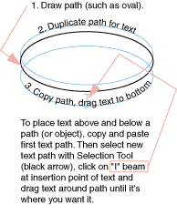
Type can also be set along a path – be it a curvy path or a polygon, or open or closed path. Draw a path, then click and hold on the Text Tool to get more options. Select the T that's kicked over on its side (Text on Path Tool).


Click on the path with that tool, and type in your text. The text follows the path! What excitement!

To move the type around on the path, click on it with the Selection Tool. Notice the "I-Beam" at the origin point of the text (if the text is set centered, it's in the center of the text; if set justified left or right, it will be at the left or right of the text). Click on the I-Beam with the Selection Tool and drag it to where you want it. If you drag it to the opposite side of the path, it will flip upsidedown.

Align type centered or on the left or right margin using the paragraph palette or control panel.

Tip: If you align the "I-Beam" with the center handle of the bounding box and align text centered using the paragraph palette, your text will center automatically and perfectly.

Converting your color art to grayscale

Color images often need to be converted to grayscale. Here's how.

Bitmapped (Raster) Images

You may have downloaded an image similar to this:


1. Launch Photoshop and open the file. You can also click and drag the file from your desktop to the Photoshop icon in the Dock and release the mouse button once the Photoshop icon is highlighted.

2. Go to Image Menu>Mode>Grayscale. Click OK when asked to discard color information.


3. If the image looks flat (lacks contrast) and needs adjusting, try Image>Adjustments>Brightness and Contrast. This image needed the contrast adjusted (more contrast).


4. SAVE the new EPS or TIFF file. "Save As" to the Documents folder. Format should be either EPS or TIFF.

Note that the file extension will automatically change to ".eps" or ".tif" Don't change the file extension yourself -- let Photoshop do it.


Be sure to give the new file a new name so as to not replace the original (so you will have both a color and grayscale version of your file).

Illustrator (vector) images

If you have an "eps" vector image such as this:


1. Launch Illustrator and open the file.

2. Select the object (in this case Select All).

3. Go to Edit menu>Edit Colors>Convert to Grayscale.

4. "Save as" with ".eps" or ".ai" format and new name to not replace the original (so you will have both a color and grayscale version of your file):


After you're all done converting and saving, PLACE it in your InDesign layout.

Spellchecking and Proofreading

Your words ­ and their spelling, punctuation and grammar ­ are as important to a layout as the design itself. Why even bother if you can't communicate your message?

Our computer software has built-in dictionaries and dynamic spelling features to help us with spelling which you'll learn to use, however spelling checkers won't correct homonyms, grammar or punctuation. For instance,

they're their there

are all spelled correctly, but their meanings and usage are different. Develop an eye for typographical errors.

Here are some of my proofreading tips:
• Look at each word carefully
• Assume words are spelled incorrectly
• Read text aloud
• Read text backwards, word by word

InDesign's Spelling Checker

In InDesign, you can check a story, the entire document or all open documents. With your document open, go to Edit > Spelling > Check spelling and follow prompts to find and replace spelling errors. If you want to see spelling errors as you type (such as are in many email programs), to to Edit > Spelling > Dynamic spelling. Incorrectly spelled words will be highlighted with red underlining.


No, there is no extra credit for finding typographical errors on this site. But thanks anyway.

Find/Change (Find and Replace)

A very useful tool is the Find/Change function in InDesign. Go to Edit > Find/Change and type or copy and paste characters into the "Find what" and "Change to" boxes. Many search and formatting functions are available -- not only can you change text, but you can change type styles, Character or Paragraph Styles, special characters and more.

Wednesday, September 1, 2010

Managing links and embedded graphics


When you Place a graphic, its original file is not actually copied into a document. Instead, InDesign adds a screen-resolution version of the file to the layout, so that you can view and position the graphic, and creates a link, or file path, to the original file on disk. When you export or print, InDesign uses the links to retrieve the original graphics, creating the final output from the full resolution of the originals.

Links can help minimize the size of a document by storing graphics outside the document file. After placing a graphic, you can use it many times without significantly increasing the size of the document; you can also update all links at once.

If the bitmap image you place is 48K or smaller, InDesign automatically embeds the full-resolution image, instead of the screen-resolution version in your layout. InDesign displays these images in the Links panel, so that you can control versions and update the file whenever you like; however, the link is not necessary for optimal output.

Note: If you move a document to another folder or disk (for example, if you take it to a service provider), be sure you also move the linked graphics files; they are not stored inside the document. You can copy all related files automatically, using the Preflight and Package features. (See Adobe InDesign Help: Performing a preflight check, and Packaging files for handoff.)

Links panel overview

All files placed in a document are listed in the Links panel. This includes both local (on disk) files and assets that are managed on a server. However, files that are pasted from a website in Internet Explorer do not display in this panel.


Links panel
A. Linked graphic file name B. Page containing linked graphic C. Embedded-link icon D. Modified-link icon E. Image from linked .indd file F. Missing-link icon G. Layer Visibility Override icon H. Adobe Stock Photos Comp icon I. Relink button J. Go To Link button K. Update Link button L. Edit Original button
A linked file can appear in the Links panel in any of the following ways:

Up-to-date An up-to-date file displays only the file’s name and its page in the document.
Modified This icon means that the version of the file on disk is more recent than the version in your document. For example, this icon will appear if you import a Photoshop graphic into InDesign, and then another artist edits and saves the original graphic in Photoshop.

Missing
The graphic is no longer in the location from which it was imported, although it may still exist somewhere. This can happen if someone moves the original file to a different folder or server after it’s been imported into an InDesign document. You can’t know whether a missing file is up to date until its original is located. If you print or export a document when this icon is displayed, the file may not print or export at full resolution.

Embedded
Embedding the contents of a linked file suspends management operations for that link. If the selected link is currently in an “edit in place” operation, this option is not enabled. Unembedding the file restores management operations to the link.

Use the Links panel

  • To display the Links panel, Choose Window > Links. Each linked file and automatically embedded file is identified by name.
  • To select and view a linked graphic, select a link in the Links panel and then click the Go To Link button , or choose Go To Link in the Links panel menu. InDesign centers the display around the selected graphic.
  • To sort links in the panel, choose Sort By Status, Sort By Name, Sort By Page, or Sort By Type in the Links panel menu or the context menu.

Placing a graphic

The Place command is used most often, and it's the recommended way to import a graphic. You can also import a graphic from your desktop, or from any removable media, by using drag-and-drop or copy-and-paste. The drag-and-drop method works like the Place command, with images appearing in the Links panel after they're imported; however, you cannot set import options for the files you drag and drop. (See InDesign Help: Alternate methods for importing graphics.)
Note: If you place or drag and drop a graphic from a removable medium, such as a CD-ROM, the link will break when you remove that medium from your system.

To import a graphic by placing it:

1. Do one of the following:
  1. To import a graphic without first creating a frame, make sure that nothing in the document is selected.
  2. To import a graphic into an existing frame, select the frame.
  3. To replace an existing image, select the graphics frame.
2. Choose File > Place and select a graphics file.
3. If you want to view the graphics file before importing, select Preview.
4. If you want to replace the selected object, select Replace Selected Item.
5. If you want to set format-specific import options, do one of the following:
  1. Select Show Import Options to see format-specific settings, and then click Open (Windows) or Choose (Mac OS).
  2. Hold down Shift as you click Open/Choose or Shift-double-click a filename.
6. If another dialog box appears, select your import options, and click OK. (See IndDesign Help: Understanding graphics formats and their options.)
7. Do one of the following:
  1. To import into a new frame, click the loaded graphics icon in the layout at the place where you want the upper left corner of the graphic to appear.
  2. To import into an existing unselected frame, click the loaded graphics icon anywhere in that frame.
  3. To import into an existing selected frame, you don't need to do anything; the image automatically appears in that frame.
If you accidently replace an existing graphic with an image you're placing, you can undo the placement by pressing Ctrl+Z (Windows) or Command+Z (Mac OS) to return the original image to the frame, and display the loaded graphics icon.

Alternate methods for importing graphics

The Place command is the primary method of importing, because it provides the highest level of support for resolution, file formats, and color, via the impaort options included with most file types. If you're creating a document where those characteristics aren't critical, you can copy and paste or drag-and-drop to import graphics into InDesign. When you use these methods to transfer a graphic into an InDesign document, some attributes of the original object may be lost, depending on the limitations of the operating system and the range of data types the other application makes available for transfer.

Copying and pasting or dragging and dropping between two InDesign documents, or within a single document, preserves all of the graphics attributes that were imported or applied. For example, if you copy a graphic from one InDesign document and paste it into another, the new copy will be an exact duplicate of the original, even including the original's link information, so that you can update graphic when the file on disk changes. (See Managing links and embedded graphics in Adobe InDesign Help.)

When copying and pasting a graphic from another document into an InDesign document, InDesign does not create a link to the graphic in the Links panel. The graphic may be converted by the system clipboard during the transfer, so both image quality and print quality may be lower in InDesign than in the graphic's original application.

Adapted from Adobe InDesign Help

Pictures

The second part of our layout equation

Words + Pictures = Layout

Pictures, or images, are representative of or similar to a real subject. They can be realistic or abstract and have great potential for expression because they do not rely on language. Remember that pictures were used as a means of written communication until the advent of the alphabet. Pictures are essential to graphic communication.

A popular psychological theory describes brain function as being lateral, or divided into left and right hemispheres. The functions of the right side of the brain are said to be intuitive, holistic and contextual, while those of the left side are said to be analytical, literal and logical. With this as our model, the combination of words (literal) and pictures (intuitive) can combine to create a more powerful message than one or the other alone.

Consider, for a moment, the word

vote


Alone, it's not very compelling. We understand what the word means, but that's about it. No emotion, no compelling call to action. It's abstract. Now combine it with a powerful image and :


AIGA Poster Competition Entry


Symbols

What do you think when you look at these pictures?


These pictures are symbols which allow communication without relying on language or written words.

A symbol is something --- such as an object, picture, written word, a sound, a piece of music, or particular mark --- that represents (or stands for) something else by association, resemblance, or convention, especially a material object used to represent something invisible. Symbols indicate (or serve as a sign for) and represent ideas, concepts, or other abstractions.
–Wikipedia.org, Symbol

Verbal or written messages can often require more mental processing than a clearly crafted pictoral image. Symbols distill the essence of a concept or message into a neat little packet : man, woman, access, mail, money, no entry...