I'm taking a poll -- what do you think about these clip art Web sites? Are the pay-to-download sites any better than the free sites? I'm using your feedback to evaluate whether or not to subscribe to a clip art service. Add your comments below, or email me to let me know your opinion.
Discovery Education
Classroom Clipart
Graphics Factory
OpenClipArt.org
MorgueFile.com
USF Clipart ETC Homepage
USDA Image Gallery
Vintage Printable
The Vintage Moth
Vector Images.com
Sunday, August 29, 2010
Wrapping text around graphics
Recommended reading: CS3 for Dummies, InDesign Ch. 5, Merging Text and Graphics, pgs. 160-163 (stop at Working with Pages).
You can make text wrap around any frame, including text frames. When you apply a text wrap to an object, InDesign creates a boundary around the object that repels text.
1. If necessary, choose Object > Text Wrap to display the Text Wrap palette.
2. Using the selection tool (black arrow) or direct-selection tool (white arrow), select a frame.
3. In the Text Wrap palette, click the button for the desired wrap shape:
To apply text wrap to items on a master page, hold down Ctrl+Shift (Windows) or Command+Shift (Mac OS) and click the item on the document page. With the image selected on the document page, apply text wrap.
You can make text wrap around any frame, including text frames. When you apply a text wrap to an object, InDesign creates a boundary around the object that repels text.
1. If necessary, choose Object > Text Wrap to display the Text Wrap palette.
2. Using the selection tool (black arrow) or direct-selection tool (white arrow), select a frame.
3. In the Text Wrap palette, click the button for the desired wrap shape:
- Wrap Around Bounding Box creates a rectangular wrap whose width and height are determined by the bounding box of the selected object.
- Wrap Around Object Shape also known as contour wrapping, creates a text wrap boundary that is the same shape as the frame you've selected (plus or minus any offset distances; see the next step).
- Jump Object keeps text from appearing in any available space to the right or left of the frame in the column containing the frame.
- Jump to Next Column forces the next paragraph to the top of the next text column or text frame.
To apply text wrap to items on a master page, hold down Ctrl+Shift (Windows) or Command+Shift (Mac OS) and click the item on the document page. With the image selected on the document page, apply text wrap.
Are picas getting you down?
Here's a way to convert units in a hurry! No more dredging around in that cumbersome Preferences submenu, just do what the pros do:
In any units dialog box, type the number of units and the unit of measurement, such as "9 in" for nine inches. If preferences are set to a unit other than inches, the software will do the conversion for you.
OR.....
In any units dialog box, type the number of units and the unit of measurement, such as "9 in" for nine inches. If preferences are set to a unit other than inches, the software will do the conversion for you.
OR.....
Here's a handy Photoshop / Illustrator trick if you're constantly flipping between pixels and inches for web and print work: Rather than going into the program's preferences to change the unit of measurement, try this; first, make sure that the rulers are turned on (Ctrl+R in Windows; Cmd+R on the Mac); then try right-clicking (Windows [or Mac]) or Ctrl+clicking (Mac) on either the horizontal or vertical ruler within your document. In the pop-up menu that appears, you can switch the unit of measurement being used.
Wednesday, August 18, 2010
Communicate with Symbols: Ideograms, Logos, Monograms
Spoken words are the symbols of mental experience, and written words are the symbols of spoken words.
– Aristotle
Quick History Lesson
For thousands of years of human pre-history, communication was only verbal. As societies became more complex, we developed means of written communication. At first crude pictures were used to represent common objects, then concepts and phonetic sounds. These early forms of written communication are known as pictograms and, later, hieroglyphs (see below).
The first true alphabet -- one which uses abstract symbols to represent sounds which are combined into words -- was developed by Semitic peoples about 4,000 years ago. The word alphabet comes from aleph and bet, the first two letters of the Hebrew alphabet.
The Adobe Suite -- InDesign (for layout) and Illustrator and Photoshop (for pictures and special typography) -- contains tools for communication. The graphic artist communicates ideas with a combination of pictures (illustrations and photos) and words (type) which combine in a layout. Simply put,
Text + Pictures = Layout
Note that not all layouts are a combination of text and pictures, some are simply one or the other. No matter what the layout, a graphic artist must combine design abilities with technical knowledge.
Pictures as a form of communication
Since we use an alphabet does it mean pictures are no longer important in communication? No, indeed. Pictures are still a very effective means of communication. We "read" pictures much as we do words, but we understand on an intuitive level and do not require common language to transmit their meaning. Consider, for instance, these international wayfinding symbols developed by AIGA in 1974 :

An ideogram or ideograph (from Greek ἰδέα idea "idea" + γράφω grafo "to write") is a graphic symbol that represents an idea or concept. They are also called pictograms or pictographs. They convey meaning through pictorial resemblance to a physical object. Earliest examples of pictographs include ancient or prehistoric drawings or paintings found on rock walls. Pictographs are also used in writing and graphic systems in which the characters are to considerable extent pictorial in appearance. [1][2]
Pictography is a form of writing which uses representational, pictorial drawings. It is a basis of cuneiform and, to some extent, hieroglyphic writing, which uses drawings also as phonetic letters or determinative rhymes. [2]
Here's my monogram, HMH, in Babylonian cuneiform:

A logo is a graphic mark or emblem commonly used by commercial enterprises, organizations and even individuals to aid and promote instant public recognition. Logos are either purely graphic (symbols/icons) or are composed of the name of the organization (a logotype or wordmark). An example of an abstract mark is the blue octagon representing Chase Bank, while an example of a representational mark is the "everyman" icon of PBS. Examples of well-known logotypes (wordmarks) are the striped IBM design, Mobil written in blue with a red "o" and CocaCola written in flowing red script. [3]
 |
| Three famous logos: an abstract mark (Chase Bank by Chermayeff & Geismar), a logotype (IBM by Paul Rand), and a pictorial mark (Girl Scouts of the USA by Saul Bass). Wikipedia.com |
 | |
| Albrecht Dürer's monogram on a wood engraving (1498). |
| Mark Twain's monogram MT on the cover of his book The American Claimant. |
| The Univerity of Texas monogram |
[1] http://en.wikipedia.org/wiki/Ideogram
[2] http://en.wikipedia.org/wiki/Pictogram
[3] http://en.wikipedia.org/wiki/Logo
[4] http://en.wikipedia.org/wiki/Monogram
http://en.wikipedia.org/wiki/Alphabet
http://www.aiga.org/content.cfm/symbol-signs
Tuesday, August 17, 2010
Typography
Type evolved from the written word. From the time Hebrews put together a nifty system of writing in the second millennim BCE (about 4,000 years ago) until the invention of cast metal type more than 500 years ago (see below), books and other documents were copied by hand or entire pages were printed from engraved or carved metal or wood plates. It could take years to hand-copy just one Bible. Or imagine copying a Buddhist sutra, over and over and over again. Because of this labor-intensive process, books and literacy were reserved for only an elite few. Movable type revolutionized printing: Books could be reproduced by the hundreds instead of by twos and threes. This method of printing didn't change much until the 20th century when computer technology created a second typographic revolution.
Typographic terms
Much of the vocabulary we use to describe type are artifacts of the early printing process using movable lead or wooden type.
Type - Alphanumeric characters for printing.
Typeface - All type of a single design, such as Helvetica or Times Roman.
Font - An assortment of type of a single size and style, such as 9 point Helvetica Italic. In movable type printing, individual letters were organized in large, flat drawers containing all the characters of a single size and style.
Type measurement - Type is measured in points. Another unit of measurement you see is the pica ( pronouced "PIE kah'). You should know 12 points = 1 pica and 6 picas = 1 inch.
Leading - The space between letters and lines are important too. Leading – pronounced "ledding," as in the element lead – refers to space between lines of text. When printing with movable type, space between lines of words was achieved by inserting thin strips of lead. Each strip was equivalent in thickness to one point. Typically two strips were added, becoming two points of leading. Today, automatic leading adds about 2 points of space between lines (e.g., 8 point type with auto leading is 10 points of leading. This may be expressed "8/10" or "eight over ten").
Kern - A part of a typeset letter that projects beyond its side bearings, such as the serif of the letter "b"
Kerning - Decreasing space between two letters, often so they touch or overlap.
Letterspacing - Adding space between letters. Opposite of kerning.
Tracking - A modern computer-based term referring to space between letters.
Serif - Times Roman is an example of a serif font. Serifs are the little ornamentations on the letters themselves. Serif fonts are generally easier to read than San Serif fonts at small sizes (8 point and smaller) or on long blocks of text.
San Serif - Helvetica is an example of a san serif font
Ascender - the part of a letter that is above the body. For example, the tall part of the letter "b."
Descender - the part of a letter that decends below the baseline. For example, the tail of the letter "y."
Body - the main portion of a letter. For example, the round portion of the letter "b." A lower case 'a' only has a body of the letter, no decenders or ascenders. A lower case 'd' has an ascender in addition to its body.
Headline or Display type – Type that introduces the text or grabs the reader's attention. Sizes are generally large, 14 pt or larger.
Subhead - Type smaller and visually less important thana headline, but still commands attention.
Body Type or Text - Type that is subordinate to the headline and makes up the main body of a page. Sizes are in the 6-12 point range. Lengthy text can be made more legible with the addition of a point or two of leading (e.g., 9 point type with 13 points of leading, 12 point type with 16 points of leading).
Text Justification or Alignment - Ragged or flush, centered, justified.
Widow - A single word on a line by itself at the end of a paragraph. Poor typographical form.
Orphan - A single word on a line by itself at the beginning of a column. Poor typographical form.
Words of advice
... Two aspects of a type … [are] … fundamental to its effectiveness. Because the common meaning of “legible” is “readable” there are those – even some professionally involved in typography – who think that the term “legibility” is all that is needed in any discussion on the effectiveness of types. But legibility and readability are separate, though connected aspects of type. Properly understood … the two terms can help to describe the character and function of type more precisely than legibility alone. … In typography we need to draw the definition … of legibility …to mean the quality of being decipherable and recognisable – so that we can say, for example, that the lowercase h in a particular old style italic is not legible in small sizes because its in-turned leg makes it look like the letter b; or a figure 3 in a classified advertisement is too similar to the 8. … In display sizes, legibility ceases to be a serious matter; a character that causes uncertainty at 8 point size is plain enough at 24 point.
-- Walter Tracy, Letters of Credit
Neat stuff
- The Chinese had a printing presses between 1041-1048. The Jikji, a guide for students in the essence of Buddhist practices, was printed in 1377 in Korea (the metal type volume predates the Gutenberg Bible of Germany by 78 years). German Johannes Guttenberg printed the Bible in 1440, which is widely accepted as sparking the European Renaissance.
- The area of a layout with type should be proportional to the unprinted area, and the choice of typeface should complement the content.
- Text in all capitals can be difficult to read because there is no variation in the letter forms, no ascenders and descenders.
- Most of the information of a letter is in the top portion. Try it for yourself! Get a newspaper that has headlines in upper and lower case letters and a piece of blank white paper. Cover the bottom half of a headline with the paper and I'll bet you can still read it. But cover the top half of the headline, and you'll probably have some difficulty making out the words.
Monday, August 16, 2010
Adobe Illustrator Basics
Tutorials
Basic Shapes, Painting, Type, Curves and more. These tutorials were written for Adobe Illustrator 7.0 and 8.0, so you'll notice that the menus and palettes have evolved. I will attempt to guide you where instructions vary from your current software – and you should take lots of notes. Tutorials are step-by-step lessons in Portable Document Format (PDF), designed to teach you the fundamentals of Illustrator. It is recommended that you print the PDF documents and go through the lessons using the sample files installed in the Tutorial folder in my faculty folder (hmh7) -- I will supply a couple of these tutorials to you as handouts. Each lesson takes about an hour to complete.
Illustrator's Toolbox and Workspace
Illustrator's workspace is very similar to InDesign's, however tools, menus and palettes differ according to each software's primary usage. Illustrator's strength is drawing with vector paths, while InDesign's is layout. Illustrator can create only single-page documents; InDesign can create multiple-page documents.
About Paths
Illustrator uses paths between points to create shapes. An open path has endpoints at each end, and anchor points along its middle. A closed path has no endpoints, only anchor points. The anchor and end points are critical to editing the shape of a path or polygon.
Draw and edit paths with a variety of tools. Freeform paths can be drawn with a the Pencil or Brush Tools. Different lines can be selected from the Brushes Palette (Window>Show Brushes) and applied to these paths. Double click on the Brush Tool for more options. Using the Pencil or Brush Tools, drag from the endpoint to continue the path. Use the Pencil to close or open a shape. Click and hold the Pencil to get the Smooth Tool. Click and drag along the path to delete anchor points and achieve desired smoothness.
Straight and freeform paths can be drawn with the Pen Tool. For straight lines - click and release the mouse to insert first endpoint, then click and release to add to the path. Curved lines - click and drag in the direction you want the bump of the curve to go.
Click and hold the Pen Tool in the Toolbox for more Pen options: add anchor points (pen with +), subtract anchor points (pen with -) and convert direction tools (^) which changes anchor points from straight to curvy. Click directly on the anchor or endpoints to edit them with these tools.
You can also use the Direct Selection Tool (white arrow) to edit paths and anchor points. Click on the line or the anchor point, and use the handles to change the shape of the path. You can also click on the anchor point itself and drag it to change the path.
Joining and Cutting Paths
Cut Path - Click on the path with the Scissors Tool. Voila! Then use the direct selection tool to grab one of the newly-created endpoints and move it where desired.
Join Path, Method 1 - Select the Pen Tool from the Tool Box and click on an endpoint, then click on the second end point. Notice that the Pen Tool changes slightly when positioned over an endpoint. Normally the Pen has a little slash (/) next to it. When positioned over the first end point it will change to a (+), then after the pen is clicked on that endpoint and positioned over the second endpoint it will change to (o). These indicate that the pen is properly positioned over the endpoints.
Join Path, Method 2 - select the endpoints using the Direct Selection Tool, then go to Object>Path>Join. You have two options for selecting more than one endpoint. (A) Click on the first endpoint with the tool, then holding down the shift key click on the second endpoint or (B) draw a selection box (click and drag a box around the endpoints with the Direct Selection Tool).
Drawing Polygons
Illustrator has more options for drawing shapes than you can shake a joystick at. There are, of course, the aforementioned Pencil, Brush and Pen tools. But there are also the Ellipse and Rectangle tools, each of which has additional options. The Ellipse tool will also draw polygons with more than four sides, stars and spirals. The Rectangle will also draw rectangles with rounded corners. You have two options for drawing with these tools. You can click and drag with the tool on the page. Or you can click and release the cursor to open a dialog box which will allow you to enter numerical values to control the shape and size of these polygons.
Scaling objects (resizing)
The Selection Tool (black arrow) will allow you to scale anything in Illustrator (even type!). Select (click on) the object, then click and drag on any handle to reshape.
Grouping and Locking Objects
These can come in handy when editing many objects at once.
To group or ungroup objects, select them then go to Object>Group or Ungroup (Command/Apple + G). These items will then act as a unit when being dragged around on the page, scaled, etc.
Locking and unlocking objects can be useful when they get in the way of editing other objects. When locked, they are immobilized. They cannot be edited or moved. When unlocked, they act normally. Select the object(s), go to Object>Lock or Unlock (Command/Apple + L).
Creating Type
There are two ways to set type in Illustrator.
1. Using the Type Tool, click and drag a text box just as in InDesign. Then begin typing as usual.
2. You can also just click on the page with the Type Tool to set type along a straight path. This has it's uses which you may find in the future.
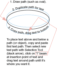
Type can also be set along a path – be it a curvy path or a polygon, or open or closed path. Draw a path, then click and hold on the Text Tool to get more options. Select the T that's kicked over on its side (Text on Path Tool).

Click on the path with that tool, and type in your text. The text follows the path! What excitement!
To move the type around on the path, click on it with the Selection Tool. Notice the "I-Beam" at the origin point of the text (if the text is set centered, it's in the center of the text; if set justified left or right, it will be at the left or right of the text). Click on the I-Beam with the Selection Tool and drag it to where you want it. If you drag it to the opposite side of the path, it will flip upsidedown.
Recommended reading: CS3 for Dummies, Illustrator (Book III) Ch. 1, Box on Vector Graphics, pg. 215; Ch. 2, Discovering Illustrator, pgs. 219-229; Ch. 3, Using Selection Tools, pgs. 231-239; Ch. 4, Creating Basic Shapes; pgs. 241-245 (stop at Tips); Ch. 5, Using Pen Tool & Placing Images, pgs. 249-261.
Basic Shapes, Painting, Type, Curves and more. These tutorials were written for Adobe Illustrator 7.0 and 8.0, so you'll notice that the menus and palettes have evolved. I will attempt to guide you where instructions vary from your current software – and you should take lots of notes. Tutorials are step-by-step lessons in Portable Document Format (PDF), designed to teach you the fundamentals of Illustrator. It is recommended that you print the PDF documents and go through the lessons using the sample files installed in the Tutorial folder in my faculty folder (hmh7) -- I will supply a couple of these tutorials to you as handouts. Each lesson takes about an hour to complete.
Illustrator's Toolbox and Workspace
Illustrator's workspace is very similar to InDesign's, however tools, menus and palettes differ according to each software's primary usage. Illustrator's strength is drawing with vector paths, while InDesign's is layout. Illustrator can create only single-page documents; InDesign can create multiple-page documents.
About Paths
Illustrator uses paths between points to create shapes. An open path has endpoints at each end, and anchor points along its middle. A closed path has no endpoints, only anchor points. The anchor and end points are critical to editing the shape of a path or polygon.
Draw and edit paths with a variety of tools. Freeform paths can be drawn with a the Pencil or Brush Tools. Different lines can be selected from the Brushes Palette (Window>Show Brushes) and applied to these paths. Double click on the Brush Tool for more options. Using the Pencil or Brush Tools, drag from the endpoint to continue the path. Use the Pencil to close or open a shape. Click and hold the Pencil to get the Smooth Tool. Click and drag along the path to delete anchor points and achieve desired smoothness.
Straight and freeform paths can be drawn with the Pen Tool. For straight lines - click and release the mouse to insert first endpoint, then click and release to add to the path. Curved lines - click and drag in the direction you want the bump of the curve to go.
Click and hold the Pen Tool in the Toolbox for more Pen options: add anchor points (pen with +), subtract anchor points (pen with -) and convert direction tools (^) which changes anchor points from straight to curvy. Click directly on the anchor or endpoints to edit them with these tools.
You can also use the Direct Selection Tool (white arrow) to edit paths and anchor points. Click on the line or the anchor point, and use the handles to change the shape of the path. You can also click on the anchor point itself and drag it to change the path.
Joining and Cutting Paths
Cut Path - Click on the path with the Scissors Tool. Voila! Then use the direct selection tool to grab one of the newly-created endpoints and move it where desired.
Join Path, Method 1 - Select the Pen Tool from the Tool Box and click on an endpoint, then click on the second end point. Notice that the Pen Tool changes slightly when positioned over an endpoint. Normally the Pen has a little slash (/) next to it. When positioned over the first end point it will change to a (+), then after the pen is clicked on that endpoint and positioned over the second endpoint it will change to (o). These indicate that the pen is properly positioned over the endpoints.
Join Path, Method 2 - select the endpoints using the Direct Selection Tool, then go to Object>Path>Join. You have two options for selecting more than one endpoint. (A) Click on the first endpoint with the tool, then holding down the shift key click on the second endpoint or (B) draw a selection box (click and drag a box around the endpoints with the Direct Selection Tool).
Tip! To add to any selection in any Adobe software programs (select more than one item at a time) select the first item, then holding down the Shift key click on the additional items to be selected.
Drawing Polygons
Illustrator has more options for drawing shapes than you can shake a joystick at. There are, of course, the aforementioned Pencil, Brush and Pen tools. But there are also the Ellipse and Rectangle tools, each of which has additional options. The Ellipse tool will also draw polygons with more than four sides, stars and spirals. The Rectangle will also draw rectangles with rounded corners. You have two options for drawing with these tools. You can click and drag with the tool on the page. Or you can click and release the cursor to open a dialog box which will allow you to enter numerical values to control the shape and size of these polygons.
Scaling objects (resizing)
The Selection Tool (black arrow) will allow you to scale anything in Illustrator (even type!). Select (click on) the object, then click and drag on any handle to reshape.
Hold down the shift key when scaling to keep the object proportional. The Shift key is your new best friend!
Grouping and Locking Objects
These can come in handy when editing many objects at once.
To group or ungroup objects, select them then go to Object>Group or Ungroup (Command/Apple + G). These items will then act as a unit when being dragged around on the page, scaled, etc.
Locking and unlocking objects can be useful when they get in the way of editing other objects. When locked, they are immobilized. They cannot be edited or moved. When unlocked, they act normally. Select the object(s), go to Object>Lock or Unlock (Command/Apple + L).
To quickly duplicate an object, select it and then simultaneously hold down the option key and click and drag it.
Creating Type
There are two ways to set type in Illustrator.
1. Using the Type Tool, click and drag a text box just as in InDesign. Then begin typing as usual.
2. You can also just click on the page with the Type Tool to set type along a straight path. This has it's uses which you may find in the future.
Type can also be set along a path – be it a curvy path or a polygon, or open or closed path. Draw a path, then click and hold on the Text Tool to get more options. Select the T that's kicked over on its side (Text on Path Tool).

Click on the path with that tool, and type in your text. The text follows the path! What excitement!
To move the type around on the path, click on it with the Selection Tool. Notice the "I-Beam" at the origin point of the text (if the text is set centered, it's in the center of the text; if set justified left or right, it will be at the left or right of the text). Click on the I-Beam with the Selection Tool and drag it to where you want it. If you drag it to the opposite side of the path, it will flip upsidedown.

Recommended reading: CS3 for Dummies, Illustrator (Book III) Ch. 1, Box on Vector Graphics, pg. 215; Ch. 2, Discovering Illustrator, pgs. 219-229; Ch. 3, Using Selection Tools, pgs. 231-239; Ch. 4, Creating Basic Shapes; pgs. 241-245 (stop at Tips); Ch. 5, Using Pen Tool & Placing Images, pgs. 249-261.
Sunday, August 15, 2010
Getting Started in InDesign
Create new document
We'll go through this together in class. To launch an application, find it's icon in the appropriate directory and double-click on it. Then create a new document from File Menu > New. Now you have a fresh blank page.
Type or Text... the first part of the layout equation
At left of your workspace is the InDesign Toolbox. Different tools do different things to the objects and type in your layout.
To put text on your page, use the Text Tool. Use your cursor to click on the T in the toolbox, then click and drag the mouse diagonally down and right to "draw" or create a text box on your blank page. Begin typing.
Use the Character Palette (right) to change type styles. Palettes are used to control aspects of items in your layout, such as type size or alignment. To apply a new style or attribute to your text, select the type by highlighting it - click and drag across the text - with your cursor, then select or change the attribute in the Character Palette.
Menus drop down from the top of the screen and control many of the same aspect that Palettes do, and a few more that they don't.
Pictures... the second part of the layout equation
Placing pictures (graphics) in InDesign Use Selection Tool (black arrow in upper left of Toolbox), go to File > Place. Locate and select a graphic from the hard drive or a disk. When the graphic has been imported into InDesign and is ready to be placed on the page, the cursor will change from an arrow to a paintbrush when the graphic is loaded. Click once on the page to "place" the graphic. (Tip: when clicking the mouse to place an image, click outside any text boxes or graphics. If you click inside, the new graphic will be placed inside and replace or move the existing item.)
Important Concept: Links
When you place pictures in an InDesign layout, you don't acutally make a copy of the graphic in your document. What you see on the page in your InDesign document is not actually the graphic file itself: it is a preview, a low-resolution representation of the graphic. InDesign creates a link to the original graphic and displays the preview to keep file sizes small.
Think of a link as a little breadcrumb trail, or a leash, or an umbilical cord... something that InDesign uses to connect to and keep track of graphics placed in a document. Because InDesign does not store a copy of the placed graphic file within your layout document, the link keeps track of all its data. If the document is printed with an outdated or broken, it can produce undesired results.
The Links Palette (at right) keeps track of all the graphics you place in your document. InDesign needs to know where the original graphic file is in order to successfully print a graphic in its proper resolution. Printing a document with a without its links (a.k.a."broken" links) can result in unattractive "bitmapped" or "jaggy" graphics. The Links Palette displays status of all the links in your document, and allows you to update or link them to different files.
Save early, save often
Be sure to save your document (file) frequently while working. Work from the computer's Documents folder, then after finished working save and close your file. Then copy the file to your Flash Drive or Memory Stick.
The safest mode of working in our lab is to work from the Documents folder. In case of an accidental freeze, crash or log-off, your files will remain there temporarily. (If you crash while working from the desktop you will lose your work.) Working from a flash drive is also not recommended -- it's much slower than working on the hard drive.
Friday, August 13, 2010
Recommended Reading: CS3 for Dummies
Here are the high points of CS3 for Dummies. Of course, feel free to read the rest of the book. (Please note this list is subject to change and updates.)
Introduction – pg. 1-6 (skip Dreamweaver and Flash on pg. 5); Bk I Adobe CS3 Basics, Ch. 1 – pg. 9-17 Intro to CS3, (up to DW). Ch. 2 – Menus & Commands, 21-30. Ch. 3 Panels & Palettes, 31-36.
Book I, Basics, Ch. 5 – Importing & Exporting, 41 (introductory paragraphs); 48-51 (stop at ‘Adding to Acrobat’); 53-56 Exporting Your Documents. Ch. 6 – Handling Graphics 57-63 (skip ‘Discovering types of fonts’ & ‘Using text and fonts on the Web’) 64-66 Fundamentals of Page Layout (skip ‘ Web page layout’).
Book II, ID, Ch. 5 - Understanding Page Layout, pgs. 151-163 (stop at Working with Pages and the Pages Panel)
Illustrator (Book III) Ch. 1, Box on Vector Graphics, pg. 215; Ch. 2, Discovering Illustrator, pgs. 219-229; Ch. 3, Using Selection Tools, pgs. 231-239; Ch. 4, Creating Basic Shapes; pgs. 241-245 (stop at Tips); Ch. 5, Using Pen Tool & Placing Images, pgs. 249-261. Working with Text pgs. 127-129, Understanding Paragraph Settings 142-143, Looking at Text on a Path 150; Illustrator Ch. 6 Assigning Font Styles, pgs. 273-274.
Photoshop (Bk. IV) Skip Ch. 1. Ch. 2 – Getting into PS CS3 Basics, 379-389 (note "Camera Raw'" 380' and "Tools'" 382-384); Ch. 3 – Messing with Mode Matters, 389-396; Ch. 4 – Creating a Selection, 397-410; Ch. 5 – Using the PS Pen Tool, 411-420; Ch. 6 – Thinking About Resolution Basics, 421-426; Ch. 7 – Creating a Good Image, 427-440; Ch. 8 – Working w/ Painting & Retouching Tools, 441-456; Ch. 9 – Using Images, 457-470 (note "Helpful Typesetting Key Commands," 461 and "Auto Align Layers," 464); Ch. 10 – Saving PS Images for Print and Web, 471-482 (pay special attention to print formats).
Subscribe to:
Comments (Atom)